The Design Is The Sign
Sign Design is one of several topics I get excited about when it comes to talking about Sign Making. It is absolutely a key element.
When making a sign, the design must be your first consideration. Without great design elements including text (or message), letterforms, contrast, color, shape and size, all is lost before you even start. These are the most common elements of design that all sign makers should consider but not the only ones. Those will be discussed in pages below on the page tree.
The sign must be recognizable in its visual environment! If the designer has accomplished this task, most of his work is done! Here would be a good place to mention that it should also be spelled correctly!
The Visual Environment
The sign designer has the opportunity to directly affect the visual environment whether personal space or commercial. The designer may be a force to improve the visual environment or make it worse for all who view it!
It is not the just act of sign writing that conveys your message. Many yard sale signs will prove my point. It is the contrast between the letterform itself and the negative space around it that make the sign readable.
Read Some Good Sign Design Books
When I returned from military service, I wanted to know more about sign design. I read Mike Stevens’ Mastering Layout where he writes about many issues that the designer must consider. He talks about Natural Layout and Negative Space.
You will find much more about these topics and many others in the following pages. The basic concepts from this book really helped me when I was just starting out as a sign painter. Before that I had been a wall dog’s helper painting signs on walls.

Briefly, Natural Layout is about leaving space between the edges of your sign and the text or graphics. He shows a general formula to accomplish this principal of layout. Adding space between the text or graphcs and the edges of your sign will greatly enhance the appearance of your sign and help deliver the message.
Negative space concerns the ratio between the strokes of the letterform and the space around those strokes. That is one of the key elements to making text readable, especially from a distance. By making the stroke of the letterform shown above slightly thinner and the contrast between the letterform and the graphic greater, the sign maker could improve the readability.
Color contrast is another key element to making a sign that is readable. Black or Red text on a white background is one of the most readable as well as black on yellow. Again, I will write more about this in the following pages.
Color Selection is another Key Element
To make your sign more appealing to the eye, you need to consider color selection. Establishing a balance between the colors of your text and graphics is another key element. I suggest that the Color Wheel is something with which you become familiar.
There are many color wheels available online, some to determine complementary colors and others to assist in mixing colors. Both are helpful to the sign designer and affordable.
Size is another Element that Promotes Readability
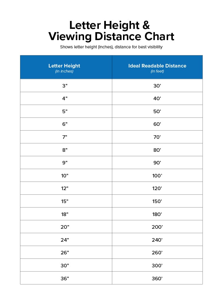
Letter visibility charts are also available online. They will give you an idea about the distance from which the letters of your sign will be visible. Many times, these charts assume maximum contrast between the letterform and the background as well as a balanced ratio between positive and negative spaces.
Bring All the Elements Together for Success at Delivering Your Message
Colorful images or logos and add interest to your sign. But take care that they do not overpower your message. A spot of color also will help draw your eyes to the sign.
I will be more specific about these and many other elements of sign design in the following pages.